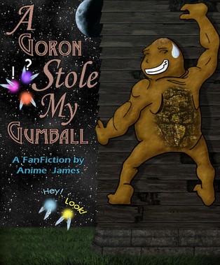
Multimedia Gallery

Fan Art, Images, Music


Home Register Login
Album list Last uploads Last comments Most viewed Top rated My Favorites Search
Home > Fan Art Gallery > Koroks Rock > Korok's Creations
Click to view full size image
"Gumball" Cover 2.0
Well, i managed to fix the gallery (w00t!) and so now i can show you the very nearly finished version of A Goron Stole My Gumball cover. This is directly based off of Feldon's sketch, and follows it closely, with a few small changes. Basically, i just added textures and shading. i used some non-commercial textures by two friends named DG and Sock, and then editted them appropriately. i use their stuff a lot, it saves me a huge amount of work. The moon is a picture of the moon i took a while ago, color adjusted for this pic.

Now, almost all that's left is to get the text colors right. Feldon, I need your input for this :) Input from anyone else would be great too, I'm sure there are lots of tweaks i can do.
gerudosheild1.jpg gerudosheild1.jpg gone.jpg gone.jpg gumball2.jpg gumball2.jpg hand.jpg hand.jpg harshcomic.gif harshcomic.gif
File information
Filename:gumball2.jpg
Album name:Koroks Rock / Korok's Creations
Rating (2 votes):
File Size:300 KB
Date added:Dec 04, 2005
Dimensions:600 x 725 pixels
Displayed:564 times
URL:http://www.zeldalegends.net/gallery/displayimage.php?pos=-9695
Favorites:Add to Favorites
Koroks Rock  [Dec 04, 2005 at 07:06 PM]
An observant artist will notice that the outlining of the goron is inconsistent. this is intentional- the lines away from the light source (the moon) are thicker, and so are the lines farthest from the viewer. This gives an increased impression of depth and lighting, augmenting the shading i've done. I'm not very fond of the hair or the back- the back because i can't seem to give it the right feeling, and the hair because it's supposed to be shaved, and i don't know how that'd look on a goron.
the_ocarina_of_time  [Feb 13, 2006 at 08:34 AM]
the goron just sort of... looks weird. the question mark and exclamation point don't really blend in well. the Hey! and Look! should be slightly darker (and it should be Look out!). awesome picture of the moon. were the stars from the same picture?
firehexer  [Feb 23, 2006 at 02:03 AM]
So, you made a picture inspired from Anime James's story? Great job!