Multimedia Gallery

Fan Art, Images, Music


Home Register Login
Album list Last uploads Last comments Most viewed Top rated My Favorites Search
Home > Fan Art Gallery > Koroks Rock > Korok's Creations
Click to view full size image
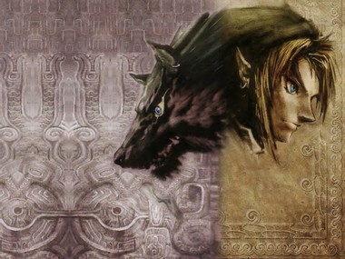
Split Nature (redone)
this is a redo of the previous wallpaper i did. as i explained on that one (though few seemed to listen), i deliberately have everything to one side. DELIBERATELY. For this one I've had to extrapolate the bg and also the wolf's neck quite a bit, which leads to the repeated patterns you see. sorry about that, but it's kinda unavoidable. i did remove the Hylian Crest and the text, to unclutter it, but i think that by changing the spliting line i recluttered it. oh well.

note that while this is not a perfect use of Rule of Thirds, \it's close enough for this purpose. think of it as Rule of Three Fifths.
gone.jpg gone.jpg bullets.jpg bullets.jpg split_wallpaper2.jpg split_wallpaper2.jpg Healthboost1.jpg Healthboost1.jpg bday_color.png bday_color.png
File information
Filename:split_wallpaper2.jpg
Album name:Koroks Rock / Korok's Creations
Rating (3 votes):
File Size:385 KB
Date added:May 29, 2005
Dimensions:1024 x 768 pixels
Displayed:669 times
URL:http://www.zeldalegends.net/gallery/displayimage.php?pos=-8343
Favorites:Add to Favorites
Iron~knuckle  [May 29, 2005 at 10:56 PM]
much better. much MUCH better. I guess thats all there is too say...bother ;P
Koroks Rock  [May 30, 2005 at 02:57 AM]
i wish i had more stone pattern to use over to the left... i may try to pull some from the trailer.
RICKY  [May 30, 2005 at 11:04 AM]
that's awesome! why don't you put the Hylian Crest in the bottom-left hand corner? because it's a nice effect!
dude_thats_evil  [May 31, 2005 at 09:46 AM]
There was one point in time, when i really didn't think your were all that you said you were at graphic design... well, consider it nuked, hung, thrown off a really tall building, stabbed, shot, scragged, punched, power of the puffed, poked, and the worst of all... BITTEN BY A BUNNY!!!
dudeofrandomness  [May 31, 2005 at 02:51 PM]
Good work, but I just don't like that depiction of Link (which of course is not your fault). Something is just wrong with his face, maybe the chin or something. I do like this way of splitting the sides though, better than the wolf facing downward (as in the original).
2of7  [May 31, 2005 at 09:31 PM]
Wooooow. THAT is COOL. End of story.
Lady of Flame  [Jun 13, 2006 at 04:39 AM]
it doesn't look cluttered to me, and i think what 's up with link's face is that it looks like he fell facefirst in mud and didn't wipe it all off, something i fault the 'lighting' for.